
Swym - A Design System
Built for Success
From pixel wars to design harmony. This case study dives deep into the transformation of the Swym design system, This helped us speed up the production and allows more focus on strategic work. Explores how we tackled inconsistencies, streamlined workflows, and built a foundation for future-ready design.


Brief
Swym specializes in e-commerce solutions that enhance customer engagement and drive sales conversion rates. Their offerings include wishlist management, back-in-stock notifications, email engagement tools, and analytics to help businesses optimize their online shopping experience and improve customer retention. Swym integrates seamlessly with various e-commerce platforms, including Klaviyo, Shopify, Dotdigital, and more, empowering retailers to
effectively engage customers and increase revenue.
Some of the engagement tools are
-
Wishlist Management
-
Back-in-Stock Notifications
-
Email Engagement
-
Personalized Recommendations
-
Automated Marketing Campaigns
A design system isn't a project.
It's a product serving products.
A design system is a framework of guidelines, components, and
documentation that ensures consistency and efficiency in creating user experiences.
Problem Statement

The old Swym design system was a recipe for frustration. Missing components, inconsistent styles, and inflexible layouts created difficulties in design-development collaboration and wasted precious time. Imagine pouring your heart and soul into crafting a beautifully spaced button, only to hear from development, This pixel padding won't work with our current library. These communication gaps were further complicated by missing components and undefined styles.
A major issue with the previous design system was the lack of flexibility and clear definitions in design components. Specific challenges included:
-
Missing Components: Essential elements like color tokens were absent.
-
Inconsistent Styles: Styles varied, leading to inconsistency across interfaces.
-
Inflexible Layouts: Design constraints made it difficult to implement creative solutions efficiently.
-
Limited Scalability: The system struggled to adapt to new requirements and growth.
THE SOLUTION
A Design System Built for Success
We updated our design approach with a new system to improve efficiency.
This upgrade includes:
• Component Library: 45+ reusable and well-documented UI components.
• Style Guide: Clear definitions for typography, color palettes, spacing, and visual elements.
• Content Guide: Ensures brand consistency and clarity across all platforms.
• Documentation: A comprehensive resource for Do's and Don'ts onboarding, guidelines, and best practices.

OVERVIEW

Before we Proceed
The Team
Design Lead, Product Managers, Visual Designer, UX Designers, Copywriters, Developers and QA team.
My Role
I identified design flaws in the design system and conducted research to find improvements. I created and updated UI components, collaborating closely with
UX designers and developers for their implementation. Additionally, I ensured design consistency and usability throughout the project by establishing guidelines and standards that align with UI design principles and user requirements. I also conducted usability testing within the design system team to understand user needs and preferences.

Key Components Overview
THE RESERCH
Competitive Analysis

In our competitive analysis, we thoroughly studied industry leaders like Shopify, Ant Design,
and MUI. We examined their design principles, component libraries, and user interfaces to identify best practices in design and development. By exploring potential features and functionalities, we gained valuable insights into current trends and user-centered approaches. These findings played a crucial role in shaping our strategic decisions, ensuring that our design system meets and exceeds industry standards while aligning with user expectations and emerging market trends.


THE GOAL
The idea we wanted to execute
• Seamless Collaboration: Bridge the gap between design and development.
• Proper Components: There should be all the components that are frequently used.
• Consistent Experiences: Deliver cohesive and intuitive user interfaces across all Signifire products.
• Future-Forward: Create a foundation for design enabling rapid adaptability to changing needs.
• A worthy upgrade: Changing outdated UI to Modern UI
Some early brainstorming
Planning for the design system included gathering insights into industry trends and user needs, accompanied by initial sketches to visualize concepts and potential solutions.

.jpg)

What have we created?
We have designed over 45+ components each have its own correction and uniqueness and showing all of them at one place is not possible. So Lets have a look at some major ones...
Key Components

And many more...

Our Design System Contains
We followed atomic theory of design
Atomic design is a methodology in design that breaks down user interfaces into
smaller, reusable components to create cohesive and scalable design systems.
Sub-Atomic
Atoms
Molecules
Organisms
Templates

Old

There was no defined colourstyles to keep our designers stay on the track to maintain consistency. There are very high chances of error
Now we have defied colour styles for each element and components so that there is
no chance any for error.
New

When it comes to Data tables, it is the most used design element in our products, and while designing it we had to do all the manual work to make the table responsive even a little bit. Each column was undefined, manually done
Now you have complete control over layouts
and any desired case can be achieved by playing with its properties of variants

There was no component library to use these design patterns as pre-made. We had to do manual changes,
for ex - to the buttons, like sizes, paddings, icons, labels, colour, states and types, and hence the chances of breaking the consistency increases.
There is now pattern library of more than 45 components along with all the cases covered.
We can just drag the button component and
make the desired case with its given properties.
Old
New
Impact
This design system marks a significant step forward for our organization. It allows us to create consistent and memorable experiences efficiently, significantly reducing time and manual effort. Key benefits include:
-
Ensuring consistency across platforms and products.
-
Streamlining design and development processes, reducing manual work.
-
Optimizing resources and cutting down operational costs.
-
Enhancing user satisfaction and engagement.
This system represents a game-changer for our organization, enabling us to achieve more in less time and with greater efficiency.

THE VIEW
Some Visuals
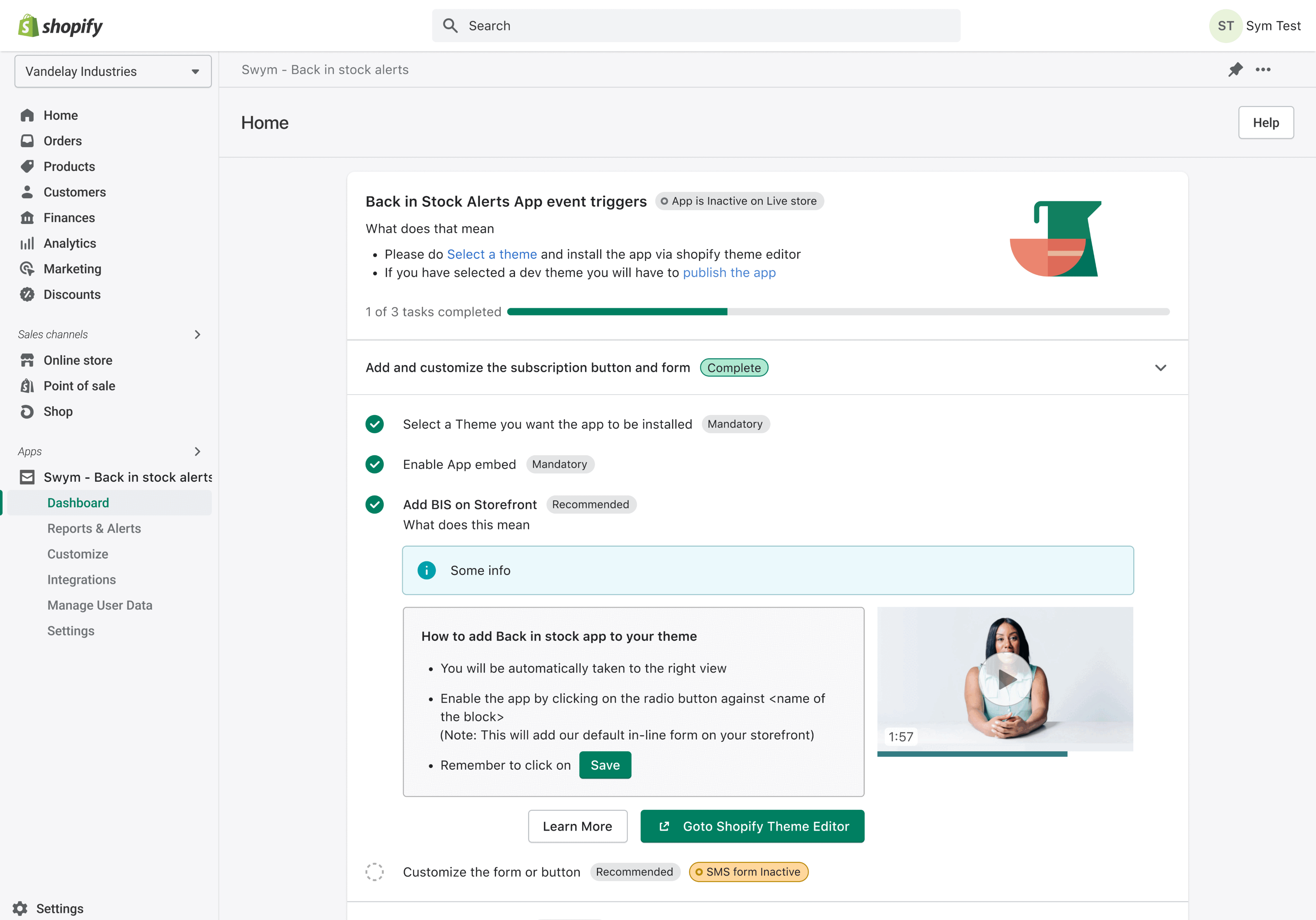
Swym's Back-in-Stock Notifications tool helps businesses retain customers by notifying them when out-of-stock items become available again. Key features include a sign-up option on out-of-stock product pages, where customers can enter their email to receive alerts. When the item is restocked, an automated email notification is sent to inform the customer. This tool integrates seamlessly with various e-commerce platforms, ensuring a smooth and effective way to re-engage customers and boost sales. The tool includes screens for customer sign-up, notification settings, and email alerts.

LEARNINGS
Outcomes
This design system has transformed our design and development landscape. Design-development friction has eased, replaced by streamlined collaboration. Our products now boast unmatched consistency, and we've saved countless hours previously lost to rework and misaligned styles. We achieved at least 90% of what we initially envisioned.
We created this system with the future in mind. It is scalable and adaptable, capable of accommodating our organization's growth and evolving business requirements. With this system, we can seamlessly integrate new features and technologies, eliminating the need for costly redesigns and reworks.

There is always so much scope for improvement... :)