Anita Dongre
The Online Brand Experience for The Fashion Conscious Modern Indian Woman


The Story
AND label was launched in the early 2000s and immediately made an impact for one principal reason. It provided not just fashionable but also immensely practical clothing for the modern Indian woman. She is constantly evolving, and her changing lifestyle demands clothes that make her feel comfortable, no matter the activity, be it work, relaxation, or play. Embracing the values of sustainability and eco-friendly practices, AND ensures that its clothing lines have a minimal environmental impact, further enhancing its appeal. Today, AND is retailed through 250 points of sale, which include 41 exclusive stores and over 200 other established multi-brand lifestyle formats.
The AND woman is always evolving, and her dynamic lifestyle demands clothing that keeps her comfortable and stylish, whether she's working, unwinding, or enjoying her time off.
This leading Indian fashion brand came to us with a very crucial set of challenges regarding their e-commerce website. Since their target users encompassed working women with busier schedules, their shopping experience needed to be highly streamlined, while also engaging them to browse and make purchases without any hesitation or hurdles.
The brand needed to be well portrayed through the website. It needed not just good design, but also a virtual expression of the brand’s proposition.
The Focus
Revamping the shopping experience for one of the biggest brands in the Indian fashion industry, the Anita Dongre signature label, AND, was a significant project. Our focus was on differentiating AND through distinctive UI and UX design elements and improving features.
We aimed to enhance user engagement on AND's e-commerce platform by adding intuitive features. These improvements were designed to not only attract users but also retain them, providing a seamless and enjoyable shopping experience.
The Design
The revamp of AND's website involved making design changes from the micro level and scaling them up as needed. This holistic design overhaul began with UI/UX changes aimed at enhancing the overall user experience. We added new features to improve brand communication and enhance the user experience.
The result was a transformed website that became a minimalistic, subtle, and intuitive portal for shoppers, aligning perfectly with AND's brand ethos and providing users with a more engaging and satisfying shopping experience.
Clearing The Clutter
AND’s earlier website had certain issues when it came to providing information in a systematic, hierarchical manner. Information hierarchy is perhaps one of the most important elements when it comes to enhancing user experience.
So, we began by making the website look a lot more mature and elegant while adding subtlety to it. Whites and greys were chosen over flashy and bubbly colors, creating a sophisticated and clean aesthetic. The text was kept to a minimum, ensuring that the content was concise and easy to understand. This approach not only improved navigation and content discovery but also enhanced visual clarity, accessibility, and overall user satisfaction.
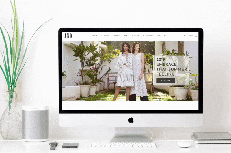
The redesigned homepage of AND's website now has two main features to appeal to different types of users. Firstly, it prominently displays the latest and discounted products, which is attractive to shoppers looking for deals. Secondly, it offers quick access to buying options for users who prefer to browse based on specific criteria, catering to focused buyers. This approach aims to enhance user engagement and satisfaction by accommodating different preferences and browsing styles. The revamped homepage of AND's website also includes a section highlighting seasonal trends, offering users easy access to the latest fashion trends and inspiration.
Streamlined Buying Decisions
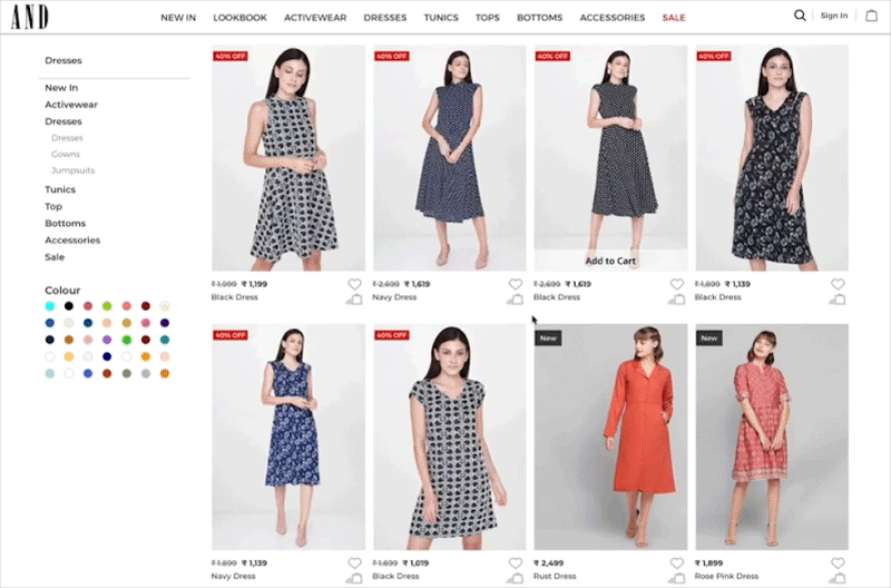
To ensure that there were absolutely zero hurdles when it came to making buying decisions, we made certain changes in the shopper’s journey. This was done at every step, from the landing page to purchasing products by adding elements like more product information, quick ‘Add to Cart’ option and making the search bar more intuitive. Lastly, we provided easy accessibility to loyalty program components to increase the number of user registrations.
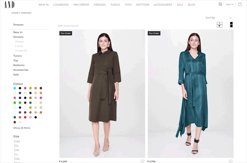
To ensure that there were absolutely zero hurdles when it came to making buying decisions, we made certain changes in the shopper’s journey from the landing page to purchasing products. We added several features, including:
-
Grid or List View: Shoppers can now choose between a grid or list view for product displays, enhancing their browsing experience based on personal preference.
-
More Options for Color Selection: We expanded the options for color selection, allowing users to easily find products in their preferred colors.
-
Size Portion on the View Layout: We introduced a size portion on the view layout, making it simpler for customers to select the right size without additional navigation.
-
Product Comparison Tool: A new feature allowing shoppers to compare multiple products side by side, making it easier to evaluate different options.
-
Quick View Option: A quick view option for products, allowing users to get detailed information without leaving the current page.
-
Wishlist Feature: Shoppers can now save products to a wishlist for future consideration, making it easier to keep track of desired items.
These enhancements aim to create a more intuitive, user-friendly, and efficient shopping experience, ultimately facilitating smoother buying decisions for our customers.

Enhancing User Engagement
While the User Interface was the first challenge to be tackled, our team also focused on improving user engagement by adding smarter content that would drive design.
The first addition was the Celebrity Spotting page. AND already has a massive appeal among celebrities, so we leveraged this by showcasing photos of them using AND products in public. This provided users with lucrative use-case scenarios and served as great non-verbal testimonials.
We enhanced engagement by making these photos interactive. Users could click on the images to learn more about the products celebrities were using, linking directly to product pages with detailed descriptions and purchasing options. Additionally, we introduced a ‘Get the Look’ feature, allowing users to find similar products to those worn by celebrities, encouraging exploration of the AND collection.
To keep the content fresh, we updated the ‘Celebrity Spotting’ page weekly, ensuring new photos and stories were added regularly. Social sharing options were integrated, enabling users to share their favorite looks and products on social media, increasing brand visibility.
User feedback was collected through surveys and comments, which we used to refine our strategies continuously. The positive responses and increased user interaction metrics validated our approach, showing that smarter content additions could significantly drive design and enhance user experience.


We combined this with the ‘Style With’ display. Users could now envisage a complete outfit while also being motivated to buy other products.
A dedicated section was provided on the landing page for AND’s social campaign, ANDiRise to enhance the brand value
While improvising on the footer section, we simplified the content, to prioritise social media synergy, along with the newsletter. This would make users engage with value-driven content that was highly relevant to the brand on the website.
Our extensive fine-tuning ultimately paid off. The AND website is now incredibly easy to navigate. Busy professionals and casual shoppers alike will find the buying process much more streamlined, regardless of whether they want to make a quick purchase, find matching attire or more. Users have reportedly begun engaging much more with the online portal, while also feeling like this is an extension of the overall brand.