We are a symbol of quality, nutrition and trust across generations.

CLIENT DISCRIPTION
Since 1929, parle has grown to become India's leading manufacturer of biscuits and confectionery. As the makers of the world's largest selling biscuit, Parle-G, and a host of other very popular brands, the Parle name symbolizes quality, nutrition, and superior taste.
Parle has made it a tradition to deliver both health and taste, with a value for money positioning that allows people from all classes and age groups to enjoy Parle products to the fullest. With a reach spanning the remotest villages of India and major cities across the world, the House of Parle has become synonymous with trust, globally. Today, the Parle brands have found their way into the hearts and homes of people all over India and abroad.
PROJECT PROPOSAL
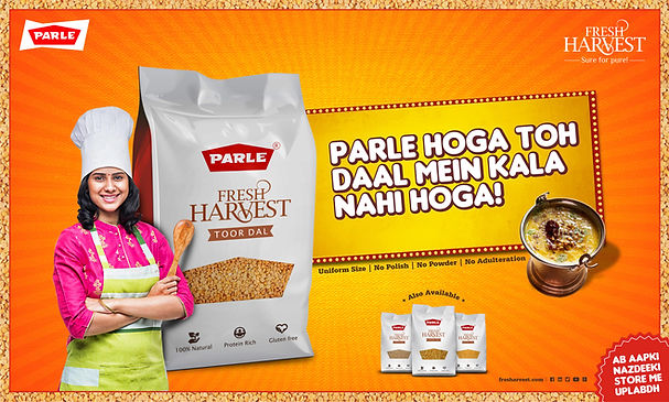
1. To design the packaging of Lentils, a new product category of brand Parle.
2. There are 3 variants within this range, Toor Dal, Moong Dal, Chana Dal.
3. Packaging should look premium, create recall and shelf value.
4. Net weight: 1 kg and 500 g. M.R.P.: 210 and 110 rupees.
5. Packaging is divided into the following design range, Indian, Traditional, and Clean, Modern approach. The Indian and Traditional design range will feature elements that reflect cultural heritage and authenticity, appealing to customers looking for a touch of tradition. The Clean and Modern design range will focus on minimalistic and contemporary aesthetics, targeting a more modern and urban demographic. Both design approaches should align with the premium positioning of the product.


The content is created with an Indian essence, so the audience can connect emotionally and mentally with the brand.
ROUGH SKETCHS


LOGO AND SPECIFICATIONS

COLOUR PALETTE

TYPEFACE: MERMAID SWASH CAPS BOLD

DIGITAL / OTHER LOGO EXPLORATIONS


VISUAL DESIGNS
Option - 1
Indian Essence - A design concept inspired by the rich cultural heritage of India. Drawing from vibrant colors, intricate patterns, and traditional motifs, this concept aims to evoke a sense of nostalgia and pride.


-
Pack looks traditional
-
The selected colours of the pack are natural & earthy
-
It actually reminds us of the Indian traditional cleaning and grinding process
-
Transparent patch so that consumers knew exactly what they were getting
-
Adding a rustic feel in order to indicate its natural, unprocessed aspects.

VISUAL DESIGN
Option - 2
Modern White - This concept embodies a sleek and contemporary aesthetic, utilizing a clean white color scheme to convey elegance and sophistication. The minimalist design approach focuses on simplicity and clarity, ensuring that the packaging stands out on shelves while exuding a sense of premium quality. The use of white creates a fresh and timeless appeal, appealing to consumers looking for a modern and refined product experience.

-
Pack looks premium.
-
Revolutionary approach
-
Typographic approach standouts from competitors
-
The white colour highlights the pack from the rest of existing packaging.
CAMPAIGNS


OTHER OPTIONS


PRINTING PROCESS
Printing Process: Flexographic retro pouch packaging
Substrate: Polyester films
PROJECT CONCLUSION
The entire project has been quite challenging and intriguing, given Parle's established brand presence in the market. Understanding the company's market challenges and identifying its competitors was one of the most difficult and crucial aspects of the process. The journey from research to concepts to final designs was heavily reliant on robust consumer feedback, ensuring that the results closely aligned with their expectations and needs.