
Drinks & Memories
About
Paperboat is a brand of traditional Indian beverages and foods produced and marketed by Hector Beverages, which is headquartered in Bengaluru, India, and was launched in August 2013. The product consists of a wide range of traditional, indigenous Indian drinks spanning from Aam Panna, Jaljeera, and Aam Ras to Thandai, Kokum, and Panakam. The company aims to preserve traditional recipes while using innovation to make the ethnic Indian drinks accessible to an urban market. It proudly boasts of its non-use of artificial coloring or preservatives in its products unlike other manufacturers in the market and hence has been given the title of an ethical beverage brand.

The Focous
-
Unique Packaging System: Created a unique packaging system for the ethnic beverage startup Paper Boat that fits its equally unique, niche proposition.
-
Experience Communication: Communicated the Paper Boat experience by combining intensely familiar tastes with nostalgic memories.
-
Traditional and Contemporary Blend: Blended the unadulterated traditional goodness of Paper Boat’s promise in a contemporary package that would appeal to its target audience.
The Design
-
Brand Development: Since Elephant built the brand from scratch, including its nomenclature, the packaging echoed its origins, values, and story in the way that best fit the narrative.
-
Design Language: The colorful, caricatured design language was utilized to capture the nostalgia of the target audience’s childhood memories.
-
Packaging Elements: Utilized every element of the packaging, from the back of the pack to the lining, in order to enhance brand recall.
-
Flexibility: Created a visual language that was so flexible that it could be instantly modified to accommodate their ever-increasing roster of flavors and product ranges.

Story
Before the name “Paper Boat” came into existence, Hector Beverages, its parent company, wanted to tap into what would later be termed the ‘ethnic beverages’ market. The Indian beverage ecosystem was already cluttered with many ready-to-drink products that were not traditionally Indian, a casual glance at any supermarket or grocery store display would highlight that. Till that point, the traditional Indian beverage was supplied through either a local vendor, think aam panna or ganne ka rus (sugarcane juice) or even better made at home for you by your mother, especially during your childhood. Hector Beverages wanted to bring this product and blend it with modern packaging and supply channels, enabling it to be purchased at stores.
So, when they came with this idea and trusted us with its branding and packaging from scratch, we knew that we had a very unique and innovative journey ahead. The naming is based on the quintessentially Indian childhood hobby of enjoying the rainy season. Children often play around the millions of freshly formed puddles by launching paper boats in them, watching them artfully glide and tackle the miniature currents.
Another key inspiration was an iconic piece of Indian music: the song "Woh Kagaj Ki Kashti Wo Barish Ka Pani." This made it clear that this wasn’t just another product or flavor for you to buy and consume. It was an experience the experience of childhood nostalgia. Naturally, the packaging system needed to accompany this radically fresh brand story. It also needed to become yet another portal for establishing brand connect and recall.


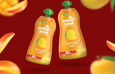
Paper Boat Alphonso Aam, Small Standee Pouch.

Paper Boat, Tetra Packs.

Paper Boat Aloe Vera Range, Stand Up Pouch

Paper Boat Penuts and Jaggery Bar, Chikki.
My Role
We were a team of three graphic designers, with our main role being to design packaging for Paper Boat drinks. I played a major role in the design process from beginning to end, including concept creation, designing, and studying packaging materials. We used design elements such as shape, color, graphics, and typography to create packaging that was both functional and appealing to customers. We decided that the colors should emulate nature, so we refrained from using synthetic or glossy-looking colors. Given the brand’s name, Paper Boat, we aimed to achieve a matte paper-like finish, which was made possible due to enthusiastic support from the printing team.
​
To ensure our design stood out, we researched competitors packaging strategies and identified ways to make Paper Boat unique. We created mood boards and sketches to explore design concepts, experimenting with different shapes and forms. Throughout the process, we focused on integrating graphic design principles, ensuring that every element was harmoniously incorporated and clearly communicated the brand's message.

The Design - A Journey Back to Simplicity
The concept behind Paper Boat's design was to appeal to their target audience, primarily people aged 25-35 in major Indian cities. We aimed to create a range of simple and healthy drinks that offered familiar tastes and evoked nostalgic childhood memories, aiming to recreate the "good old days." To communicate the brand's core idea of offering natural, unadulterated drinks reminiscent of the past but in a modern format, we developed a visual language that emphasized simplicity and purity. We used colors inspired by nature, incorporated simple visual landscapes, and adopted a conversational tone in our messaging.
​
This approach was intended to leave consumers feeling nostalgic, aligning with the brand's overall nature. Additionally, Paper Boat's distribution in local airlines such as Indigo and Jet Airways likely helps broaden their reach and create more opportunities for customers to engage with their brand. We also ensured that our designs were flexible enough to be adapted across various touchpoints, including social media, print ads, and in-store displays, maintaining a consistent brand experience. Overall, our design concept seems well-crafted to resonate with their target audience and convey the brand's unique selling proposition.
​
Paper Boat satisfied all those needs neatly as a beverage, but the packaging design had to showcase that. We paid careful attention to the packaging structure itself, choosing doy packs that provide an enhanced sensory experience, and bottle caps that are boat-shaped and easy to use. Additionally, we incorporated environmentally friendly materials to align with our audience's growing awareness and concern for sustainability. The packaging not only shows the product's quality but also highlights the brand's commitment to preserving the environment.
​
We also designed limited-edition packs featuring regional artwork and stories, creating a deeper emotional connection with our consumers. These special editions help in celebrating local cultures and traditions, further enhancing the nostalgic appeal. By continuously innovating our designs while staying true to the core brand values, we ensure that Paper Boat remains a beloved choice among its target audience.

Our team decided to go one step further and utilize every inch of these packs in order to highlight where Paper Boat was coming from.
Primarily, we textured the pack like paper and added a variety of colourful doodle-like icons, complete with text to make it playful and engaging, to mirror the margins, or the back of a well-worn school notebook.
​
You’ll find one-liners that tell you about the lack of artificial flavoring and small writeups that recreate, if just for a moment, a time and space that transports the customer back to a forgotten time and space. There are highly interesting mini-stories on the back of the pack that is personalised for each beverage – in addition to fun one-liners on the bottom, barely concealed for those who are enterprising enough to stumble upon it.
​
We recreate “The good old days”, where childhood innocence is invoked. Where time slows down as your concerns are limited to what game you must play next under the tropical sun and where you steal treats from the topmost jar in the kitchen – this time, this experience is embedded within the graphics on the pack.
​
Colorful paper boats, deliciously caricatured fruits and scenery like you would find in the drawing book of a third grader is what you’ll find here. Each flavor has a distinct color. Elephant purposely did not utilise vivid displays of the real ingredients, opting to enhance the brand story with graphics and impish flavour text instead.


Paper Boat, Display in Store for Promotion

Paper Boat Truck, Side View

Paper Boat Tin Gift Box, Includes 3 Standee Pouch

Paper Boat Truck, Back Side
Apart from Paper Boat’s unique approach in desiring to become a brand that connects with consumers through storytelling, as opposed to just their products, we also received awards for our concept and packaging design, including the Kyoorius Digital Award and The Indian Story Design Award, among others.
​
Paper Boat simply placed their products in a select few shops and then in Indigo Airlines. There was no branding, no mass media – nothing till that point to create hype. Based on the strength of the packaging system and brand story, we managed to take off and carve a niche of its own by 2018 in a market dominated by big players like Coca-Cola and Pepsi.

